Please give me some feedback on my teaching, the lab, and the class. I'll use the information to make the next class better!
Here's the handout-
Tuesday, January 31, 2012
Thursday, January 26, 2012
Wednesday, January 25, 2012
Thursday, January 19, 2012
CHRIS OATLEY
Here is a wonderful blog by a Disney/Pixar illustrator...... Lots of great drawing ideas and a treasure with this short video documenting other illustrator's work.
If you like to draw, check it out- you might discover ideas for your next project!
Here is the link @ http://chrisoatley.com/
If you like to draw, check it out- you might discover ideas for your next project!
Here is the link @ http://chrisoatley.com/
Wednesday, January 18, 2012
April Gornik
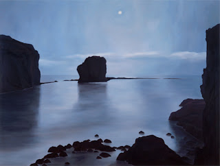
A contemporary landscape artist, look how her work is abstract in how she breaks up thew page into shapes of value and color....
See more here @ http://www.aprilgornik.com
See more here @ http://www.aprilgornik.com
FREDERIC CHURCH's Landscapes!
Look how he uses color and large shapes on the page to create drama! He also places some "prop" to help you understand the size and scale of the landscape...
See more of his work here @ http://www.artchive.com/artchive/C/church.html
See more of his work here @ http://www.artchive.com/artchive/C/church.html
EDWARD HOPPER
An American realist, Hopper's work uses strong lighting, spaces and figures to add emotion and drama to the image.
See more of his work here@http://www.ibiblio.org/wm/paint/auth/hopper/
Here are some examples:
See more of his work here@http://www.ibiblio.org/wm/paint/auth/hopper/
Here are some examples:
 |
| "Nighthawks", 1942 |
 |
| "The Lee Shore", 1941 |
Caspar Friedrich
A romantic artist, who made up his landscapes to describe visions- or images from his imagination....
see more here @ http://www.caspardavidfriedrich.org/
see more here @ http://www.caspardavidfriedrich.org/
Chuck Close!!!!!!
American realist, using a grid of colors and shapes to make a photo
See more of his work here@ http://www.moma.org/collection/browse_results.php?criteria=O%3AAD%3AE%3A1156&page_number=2&template_id=6&sort_order=1
And more here@ http://www.chuckclose.coe.uh.edu/life/index.html
See more of his work here@ http://www.moma.org/collection/browse_results.php?criteria=O%3AAD%3AE%3A1156&page_number=2&template_id=6&sort_order=1
And more here@ http://www.chuckclose.coe.uh.edu/life/index.html
Tuesday, January 17, 2012
FINAL (gasp) PROJECT!!
Here we go!
Lots to do and not much time for it!
Your final exam grade is made up of THREE parts: A drawing, a written essay, and a verbal presentation..... The writing and presenting are ways to practice EXPLAINING your work.
The Drawing will be for the 20X30 competition, and is submitted in June.
Your drawing must demonstrate your understanding of these concepts: CREATIVITY, ELEMENTS AND PRINCIPALS, MATERIALS and CRAFTSMANSHIP.
THE CATCH
The one "catch" to the project is this YOU MUST COMBINE HAND MADE WITH PRINTED drawing skills! So, your work is not only created on the computer, it involves "hand made" work as well.
Here is an amazing example of what I mean! This is the work of the artist "Asbestos". See more of his work @http://twistedsifter.com/2009/07/street-art-by-asbestos/
My background was in art history, studying in Dublin and Rome, but all the time working on my own ideas and skills. I never went to art school, so I’ve had to learn everything off friends or worked it out myself. But I do find it essential to know what came before me and to draw on the these influences. Caravaggio was a great influence as was Velasquez because his skin tones are mesmerizing. But I’ve also been influenced and inspired by the Pop art of Warhol, Raushenberg and Rosenquist
- from Artasty interview
 |
| Retreat of Reason – 140x190cm (55 inches x 75 inches) |
 |
| Overflow – Mixed media on found wood with old book pages pasted on. The background has random written overflows of thought. |
Wednesday, January 11, 2012
HOMEWORK ALERT!
Here's a new homework assignment for you!!
Practice "Foreshortening", the visual distortion that happens when looking at objects from one end. Your challenge is to create a drawing that demonstrates this visual effect.
Draw your legs and feet, or arms and hand to show foreshortening.
Here are some photos for example:
Your drawing should use these "tricks" to make the foreshortened illusion:
1. Parts of the object overlap other areas...
2. Objects close to you appear larger, further away= smaller.
3. Closer objects are in focus, further away = blury
Here are some other photos and drawn examples...
An egg carton from the side- all shapes are the same size and in an even row...
When viewed from the end, the closer side is larger, the top and bottom lines are angled, and the individual "bumps" in the carton overlap each other....
That's foreshortening... Here are some examples in drawings:
The above piece, by Mantegna, is a great example of foreshortening- except that he shrank the size of the feet! They would appear larger in real life, because they are closer to you. The artist was trying to make the figure not seem abnormal...
Practice "Foreshortening", the visual distortion that happens when looking at objects from one end. Your challenge is to create a drawing that demonstrates this visual effect.
Draw your legs and feet, or arms and hand to show foreshortening.
Here are some photos for example:
Your drawing should use these "tricks" to make the foreshortened illusion:
1. Parts of the object overlap other areas...
2. Objects close to you appear larger, further away= smaller.
3. Closer objects are in focus, further away = blury
Here are some other photos and drawn examples...
An egg carton from the side- all shapes are the same size and in an even row...
When viewed from the end, the closer side is larger, the top and bottom lines are angled, and the individual "bumps" in the carton overlap each other....
That's foreshortening... Here are some examples in drawings:
 |
| Hendrik Goltzius, "The betrayers 3, Phaeto"- this is an etching. |
 |
| foreshortening simple shapes.... |
 | ||||
| The Lamentation over the Dead Christ, by Mantegna, 1490 |
Ben Bronstein's wonderful lines!
Here's a great collection of line based images!!!
Ben is fantastic at paying attention to the size, direction and shape of the lines in his work..... beautiful stuff!
Check his web site to see more and more line work!
It's here @ http://benbronstein.com/blog/?m=200910
Ben is fantastic at paying attention to the size, direction and shape of the lines in his work..... beautiful stuff!
Check his web site to see more and more line work!
It's here @ http://benbronstein.com/blog/?m=200910
 |
| Detail of the sketch for an illustration |
 |
| another detail... |
 |
| "Chimera Attack" |
 |
| the full illustration |
Tuesday, January 10, 2012
Timeline of work this week!
Here are your choices for today, Tuesday:
FIRST
Complete the "Clementine Drawing" and print it onto the 13X19 paper......
Post an image of it to the blog and answer these questions about it:
1. What colors did you use?
2. How and where did you use VALUE, Color SATURATION, or EDGES to create the illusion of depth?
3. What is the best part of your image?
SECOND
Complete the "Cloth Study" that was homework-
1. Be sure you used each of these techniques: range of values, sharp and soft edges, careful drawing of the shapes of folds...
2. If there is a camera in the desk, photograph the drawing and post it to the blog.
THIRD
Start work on the Illuminated Letter" for the Deep End. Use Photoshop's brushes and only BLACK marks on white!
Examples are on the posting before this one...
ILUMINATED LETTERS
Creating an image for the "Deep End" school publication. Choose a letter and illustrate it, using line, dashes, and solid shapes. Create a variety of patterns, values and marks to make the letter interesting to the audience.
Here are some examples of midieval letter designs....
This image is from one of the most famous of these "illuminated books" called The Book Of Kells. It was created in Scotland around 800 AD by Monks, and contains the four Gospels. The book is world famous for it's lavishly decorated pages...
see more of it here @http://en.wikipedia.org/wiki/Book_of_Kells
and here @ http://en.wikipedia.org/wiki/Book_of_Kells
Sunday, January 8, 2012
BIG ACTIVE
Big Active has a collection of illustrators work that will surely inspire you!
I am particularly interested in the ink work of Vania Zouravliov, a Russian born master of line and value. He was a successful illustrator by the age of 13!
Here is some of his work-
Check out the BIG ACTIVE site @ http://www.bigactive.com/illustration.
And VANIA's site @ http://www.vaniazouravliov.com/
Monday, January 2, 2012
The "T-Shirt Drawing", a drapery study
Here's a quick one, with a great deal of skills used in one drawing...
Create a drawing of a draped cloth (a T-shirt in this case)...... with a "twist"- the drawing is created using WHITE charcoal on BLACK paper! You must work "backwards", building up the light values ad leaving the darks alone!
Here are some sample drawings of drapery....
Create a drawing of a draped cloth (a T-shirt in this case)...... with a "twist"- the drawing is created using WHITE charcoal on BLACK paper! You must work "backwards", building up the light values ad leaving the darks alone!
Here are some sample drawings of drapery....
 |
| By Durer! |
The above drawing is by Aubrey Pugh-Ellis (Wolf Daughter Designs)
Subscribe to:
Comments (Atom)


